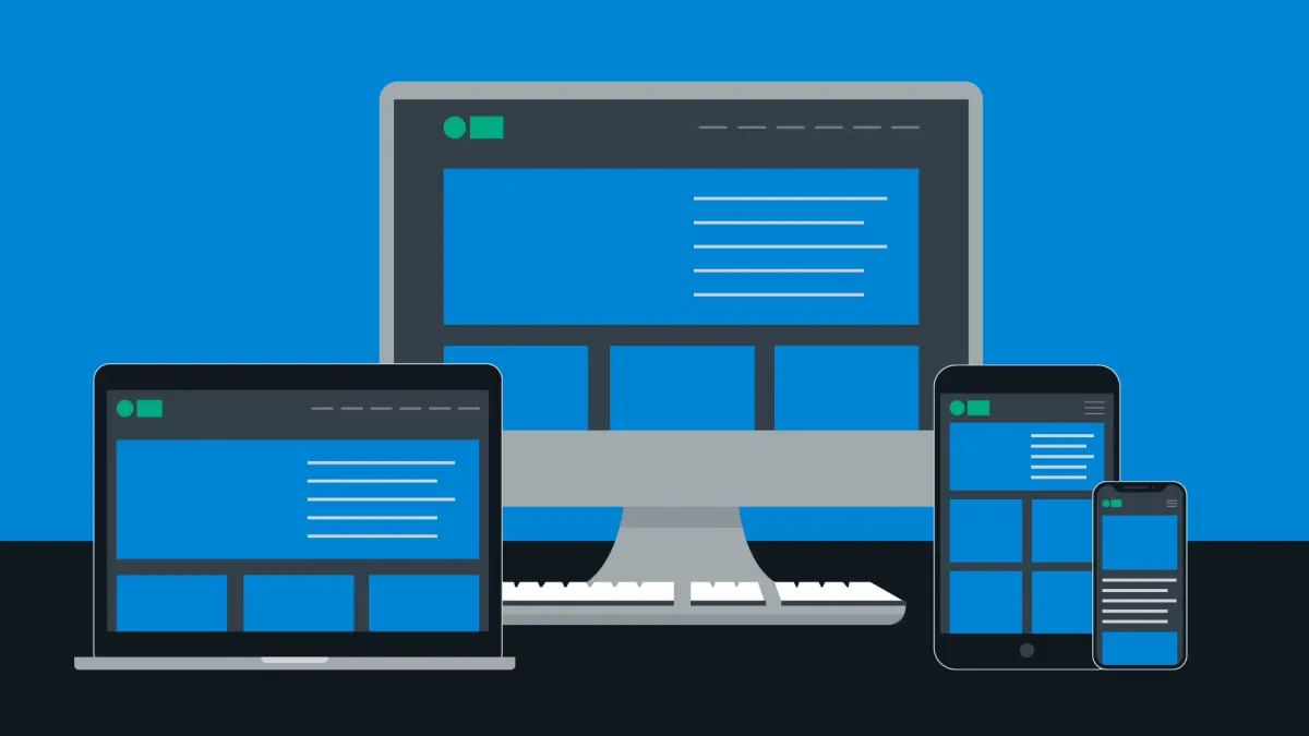
The number of people browsing the web on their mobile devices is growing faster with every day, so to accommodate website designs to these new, smaller screened devices (and tablets too), web designers and front end developers have started having to create “responsive” websites. This post is intended to give you a general understanding of responsive web design techniques.
First, when designing a responsive website, you need to set up your web page with the proper meta viewport. To do this, simply add this line of code to your web pages header:
<meta name="viewport" content="width=device-width, initial-scale=1.0">
By adding this meta viewport, you are telling the web browser to render the web page at the device’s screen resolution, instead of defaulting to a desktop view. Now, when you design a web page for different screen resolutions, it is important to remember to size your containers and DIV elements appropriately, you that you can easily scale them to multiple resolutions.
For example, say you have a list of products on a page. On a desktop computer, which might display the main product container element at 900 pixels, shows 3 items per row. On a tablet, you could then, using responsive web design techniques, show just 2 products per row, and on a mobile phone, just 1 per row. Scaling these elements dynamically based on screen size is done with responsive CSS media queries.
A CSS media query tells the browser to interpret elements differently, based on the screen resolution at any given time, allowing you to create multiple versions of the same web page for different displays. A media query looks something like this:
@media (min-width: 500px) and (max-width: 600px) {
  h1 {
    font-size: 20px;
   }
}
The above query tells the browser that, on screens between 500 and 600 pixels wide, to adjust the font size of all Header 1 tags to 20 pixels, and when the resolution is less then 500 pixels, or more then 600 pixels, these styles will be ignored.
Here is an example CSS document based on the sample I referred to earlier, with the product columns:
#container {
   // fill the screen with the container
   width: 100%;
}
#container .products {
// make each product block fill one third of the screen, and align them left to right
width: 33%; display: block; float: left;
}
@media (min-width: 601px) and (max-width: 768px) {
  #container .products {
     // make product containers on tablets fill one half of each row
     width: 50%;
  }
}
@media (max-width: 600px) {
#container .products {
// make product containers on mobile phones fill the entire row
width: 100%;
}
}Let’s review again: the product containers start at 33% (one third) of the width of the main container. Then, on tablets, this is adjusted so that each product container is one half of the main container, and then finally, on small screens and mobile phones, the product containers fill the entire row. Each of these sets of minimum and maximum dimensions is called a “break point”, or the point at which the browser will adjust the CSS styling of your content.
To end off, here is a list of some of the most common “break points” in use right now – happy designing!
/* Smartphones (portrait and landscape) ----------- */
@media only screen and (min-device-width : 320px) and (max-device-width : 480px) {
/* Styles */
}

/* Smartphones (landscape) ----------- */
@media only screen and (min-width : 321px) {
/* Styles */
}

/* Smartphones (portrait) ----------- */
@media only screen and (max-width : 320px) {
/* Styles */
}

/* iPads (portrait and landscape) ----------- */
@media only screen and (min-device-width : 768px) and (max-device-width : 1024px) {
/* Styles */
}

/* iPads (landscape) ----------- */
@media only screen and (min-device-width : 768px) and (max-device-width : 1024px)
and (orientation : landscape) {
/* Styles */
}
/* iPads (portrait) ----------- */
@media only screen and (min-device-width : 768px) and (max-device-width : 1024px)and (orientation : portrait) {
/* Styles */
}
/**********
iPad 3
**********/
@media only screen and (min-device-width : 768px) and (max-device-width : 1024px)and (orientation : landscape) and (-webkit-min-device-pixel-ratio : 2) {
/* Styles */
}
@media only screen and (min-device-width : 768px) and (max-device-width : 1024px)and (orientation : portrait) and (-webkit-min-device-pixel-ratio : 2) {
/* Styles */
}
/* Desktops and laptops ----------- */
@media only screen and (min-width : 1224px) {
/* Styles */
}
/* Large screens ----------- */
@media only screen and (min-width : 1824px) {
/* Styles */
}
/* iPhone 4 ----------- */
@media only screen and (min-device-width : 320px) and (max-device-width : 480px)and (orientation : landscape) and (-webkit-min-device-pixel-ratio : 2) {
/* Styles */
}
@media only screen and (min-device-width : 320px) and (max-device-width : 480px)and (orientation : portrait) and (-webkit-min-device-pixel-ratio : 2) {
/* Styles */
}Was This Helpful?
If so, please consider making a donation - your support allows me to continue putting out content like this!